What Is Morandi Color & How to Achieve in Photoshop?
Throughout this tutorial, we will delve into the unique characteristics of Morandi colors and provide you with practical techniques to infuse your photos with their enchanting allure.
Prepare to embark on a journey into the mesmerizing world of Morandi colors as we uncover the secrets behind this captivating palette and unlock the potential for artistic expression in your photo editing. Let's dive in and discover how to evoke the tranquil beauty of Morandi colors in your photographs.

In this article, you will learn:
- What Is Morandi Color?
- Applications of the Morandi Color Palette
- How to Achieve the Morandi Color Style in Photoshop?
- Final Thoughts About Morandi Color
What Is Morandi Color?
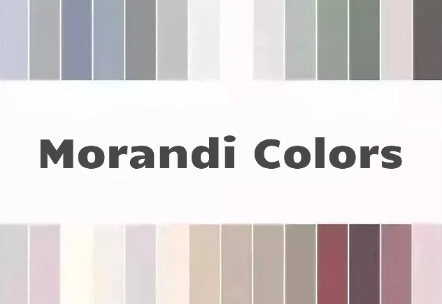
The Morandi color palette draws its inspiration from the personal style of Italian artist Giorgio Morandi. It employs low saturation, low contrast, and muted hues, giving the overall composition a grayish tone that exudes a sense of tranquility, mystery, elegance, and nobility.
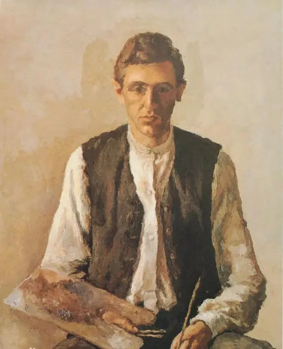
self-portrait by Giorgio Morandi
During Morandi's formative years, the French Impressionist movement was flourishing. With its vibrant and luminous colors, it aimed to capture the stunning beauty of nature. However, Morandi took a different approach and created still-life paintings characterized by low saturation and serene, soothing tones.
Throughout his entire career, Morandi's unique sensitivity to tone, color, and compositional balance set him apart from others and gave birth to the distinctive Morandi style.
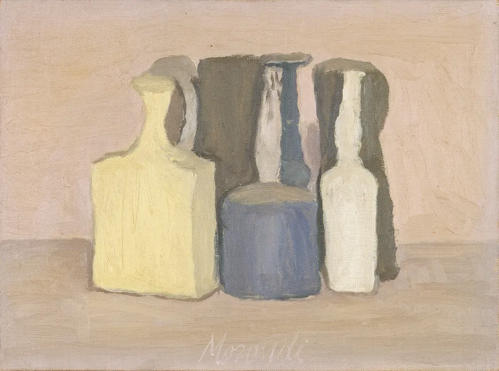
In Morandi's paintings, one can observe an absence of vibrant colors, as he preferred muted tones, grays, whites, and other subdued shades. His favorite subjects included various bottles, jars, and flowers in his studio, and most of his artwork was created within the confines of this space.
Morandi colors can harmonize exceptionally well with other colors such as gray, white, and deep blue, making them suitable for various design styles and occasions.
In recent years, this color palette has gained immense popularity on social media, becoming a favorite among fashion bloggers, brands, and young individuals, consequently spreading widely within the realms of design and fashion.
Applications of the Morandi Color Palette
The Morandi color palette finds widespread usage in various fields. Below, we will share some common examples where you can explore and incorporate these colors into your own style, bringing them to life in your daily life and design projects.
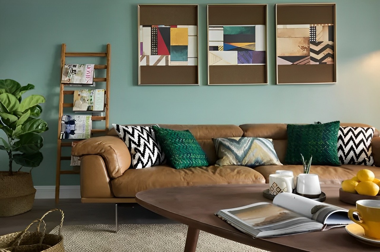
1. Interior Design
The Morandi color palette is extensively utilized in interior design. By employing Morandi colors, your entire room can exude a sense of sophistication and enduring appeal.
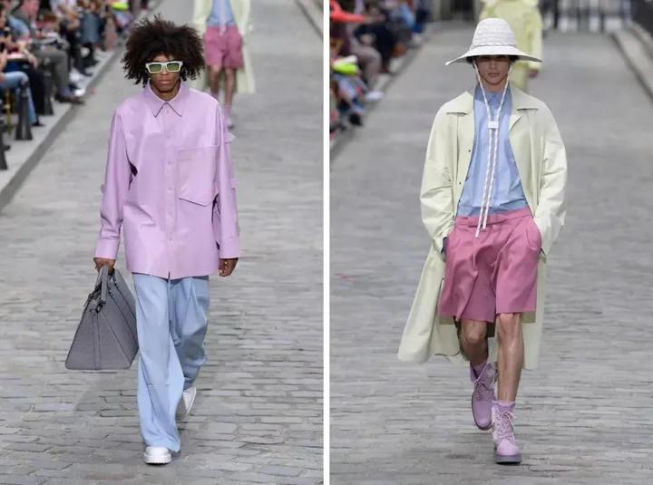
2. Fashion Design
The Morandi color palette offers a plethora of colors that have been described as the embodiment of gentleness. It has become a favorite choice among fashion designers seeking to infuse their creations with a touch of elegance.
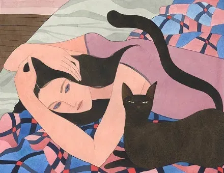
3. Illustration Design
Illustrators also appreciate the Morandi color palette. By using Morandi colors in their designs, they achieve a visual balance where different hues complement and counteract each other, resulting in a perfect equilibrium.
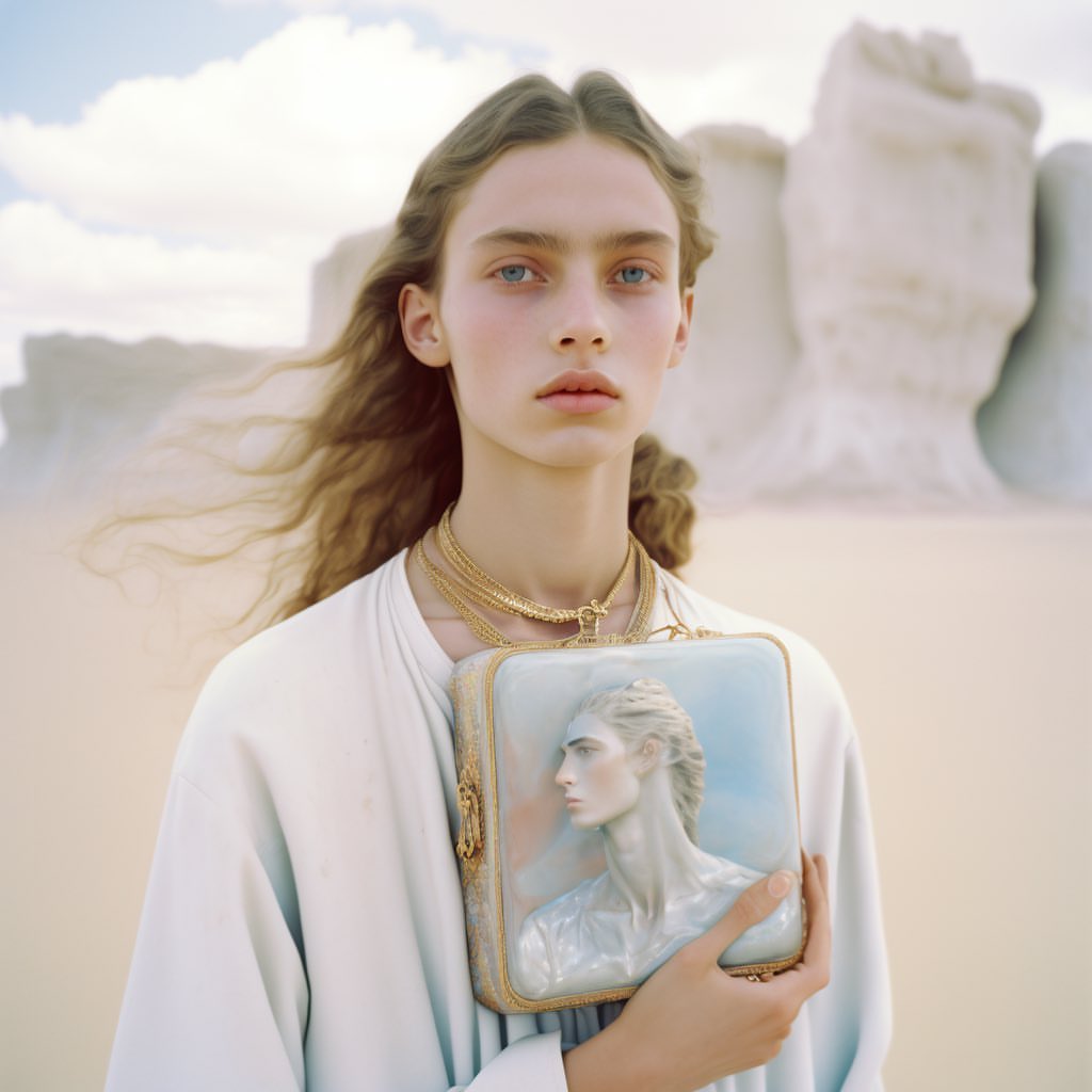
4. Photography
Photographer Neyle Ne Giysek has masterfully incorporated the Morandi color palette into her work, achieving a perfect balance. In Neyle Ne Giysek's compositions, one can often find a harmonious and gentle color scheme that unifies the entire image.
Neyle Ne Giysek has openly shared her sources of inspiration on social media, and it is none other than the paintings of artist Giorgio Morandi. The way Giorgio Morandi utilized colors in his artwork serves as a valuable reference for photographers seeking to enhance their photographic creations.
How to Achieve the Morandi Color Style in Photoshop?
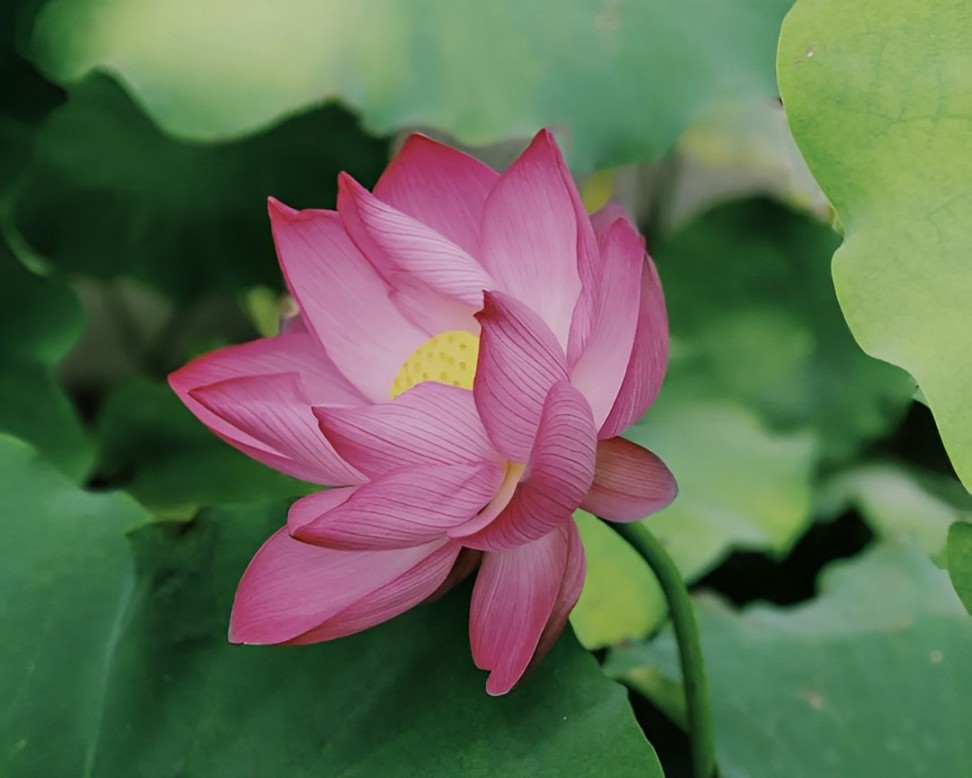
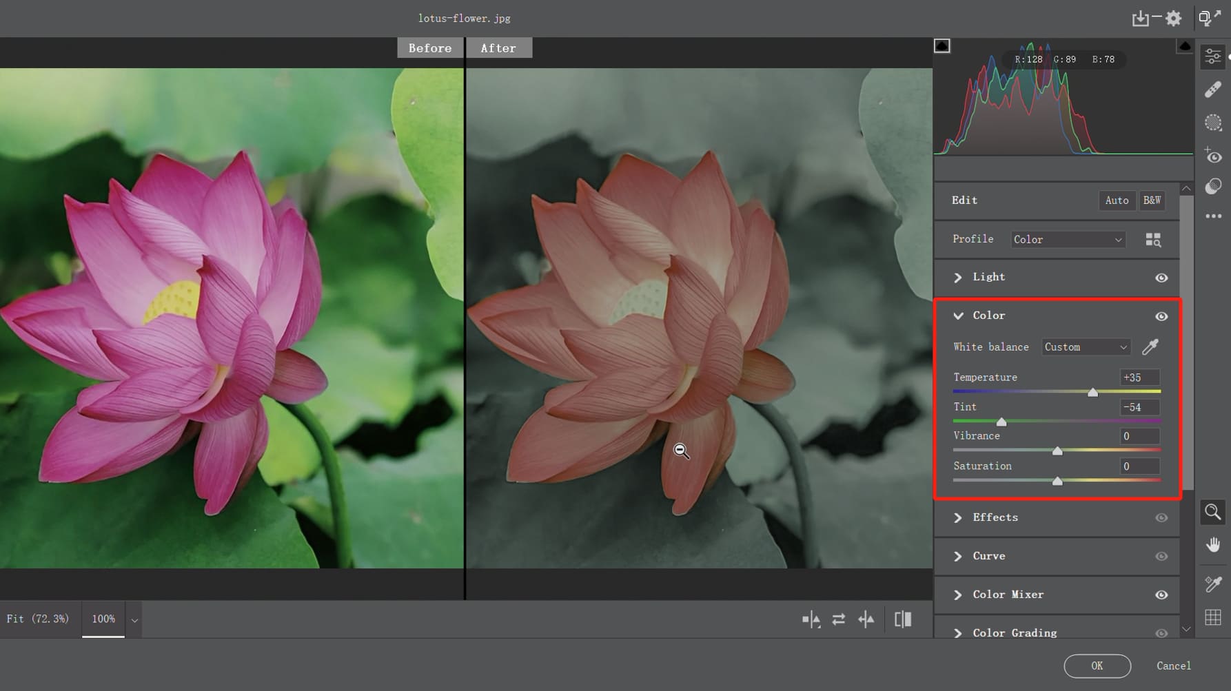
In this section, we will use the following photo as our material and guide you through the process of achieving the Morandi color style using the Camera Raw filter in Photoshop.
Let's open Photoshop and import the photo. Once it's imported, make sure to convert it into a smart object. Then, select the Camera Raw filter from the Filters menu.
Before we begin adjusting the photo, let's analyze the original image. The overall contrast of the photo seems a bit high, with a noticeable black-and-white contrast.
Color Grading Thinking:
The reason why Morandi-style photos have such an enduring appeal and a soft, gentle look is because their contrast is very low.
The majority of the Morandi image consists of gray information, which means that the white in the image is not very white, and the black is not very black. Thus, there is a significant presence of gray in the photo.
So, our first color grading step is to reduce contrast, making the white less white and the black less black.
Here's how to achieve this:
- Lower the Highlights and Whites: This will make the white less bright.
- Increase the Shadows and Blacks: This will make the black less dark.
- Decrease the overall Exposure to reduce contrast.
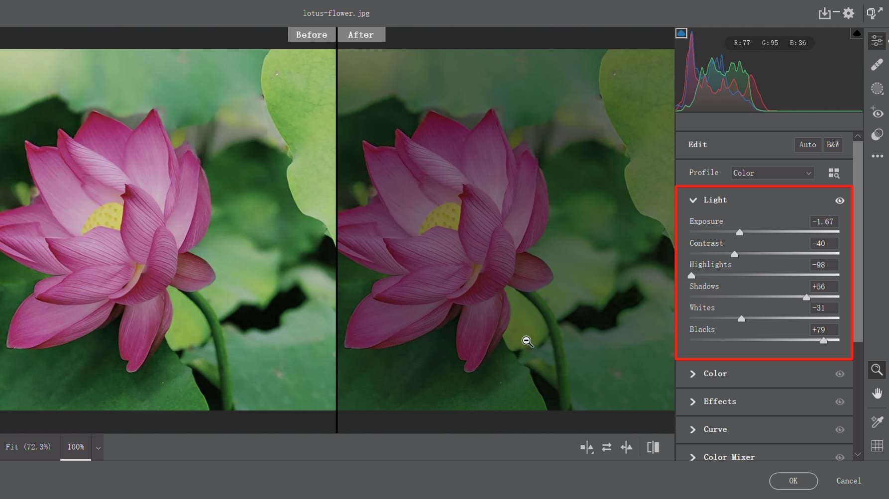
If you feel that the contrast of the image hasn't been significantly reduced, you can also use the Curves adjustment to decrease or increase the brightness of specific areas. This step primarily relies on your own perception and personal preference.
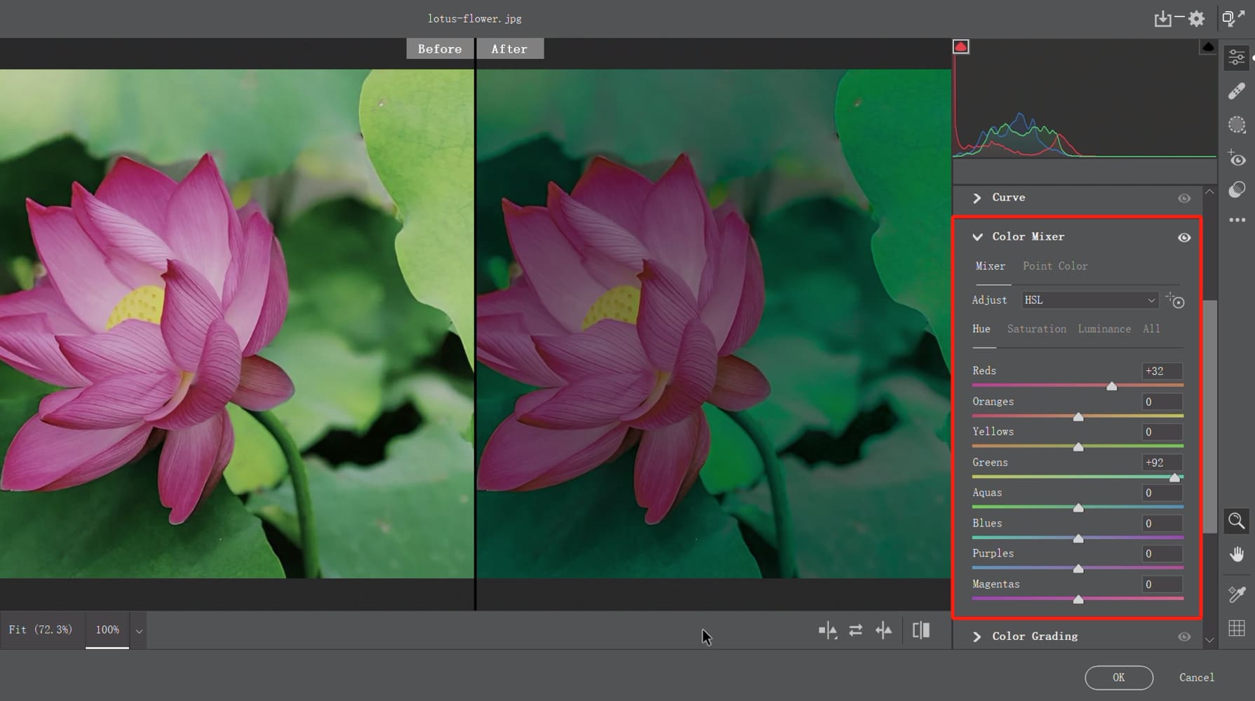
The photo we are working with is an image of lotus leaves and lotus flowers. To achieve the Morandi color tone in the photo, the most important aspect is to handle the color relationship between the green lotus leaves in the background and the orange-red lotus flowers in the central area.
Color Grading Thinking:
- Background lotus leaves: green color, low saturation, high brightness.
- Central area lotus flowers: orange-red color, low saturation.
Let's proceed with the color adjustments by selecting the Color Mixer to modify the color relationship in this photo. First, let's focus on the Hue section of the HSL setting:
- Move the Green slider to the right: This aims to increase the amount of green in the background and transform other neutral colors into shades of green.
- Adjust the Red slider towards the orange hue: This will transform the warm color of the lotus flowers into an orange-red shade.
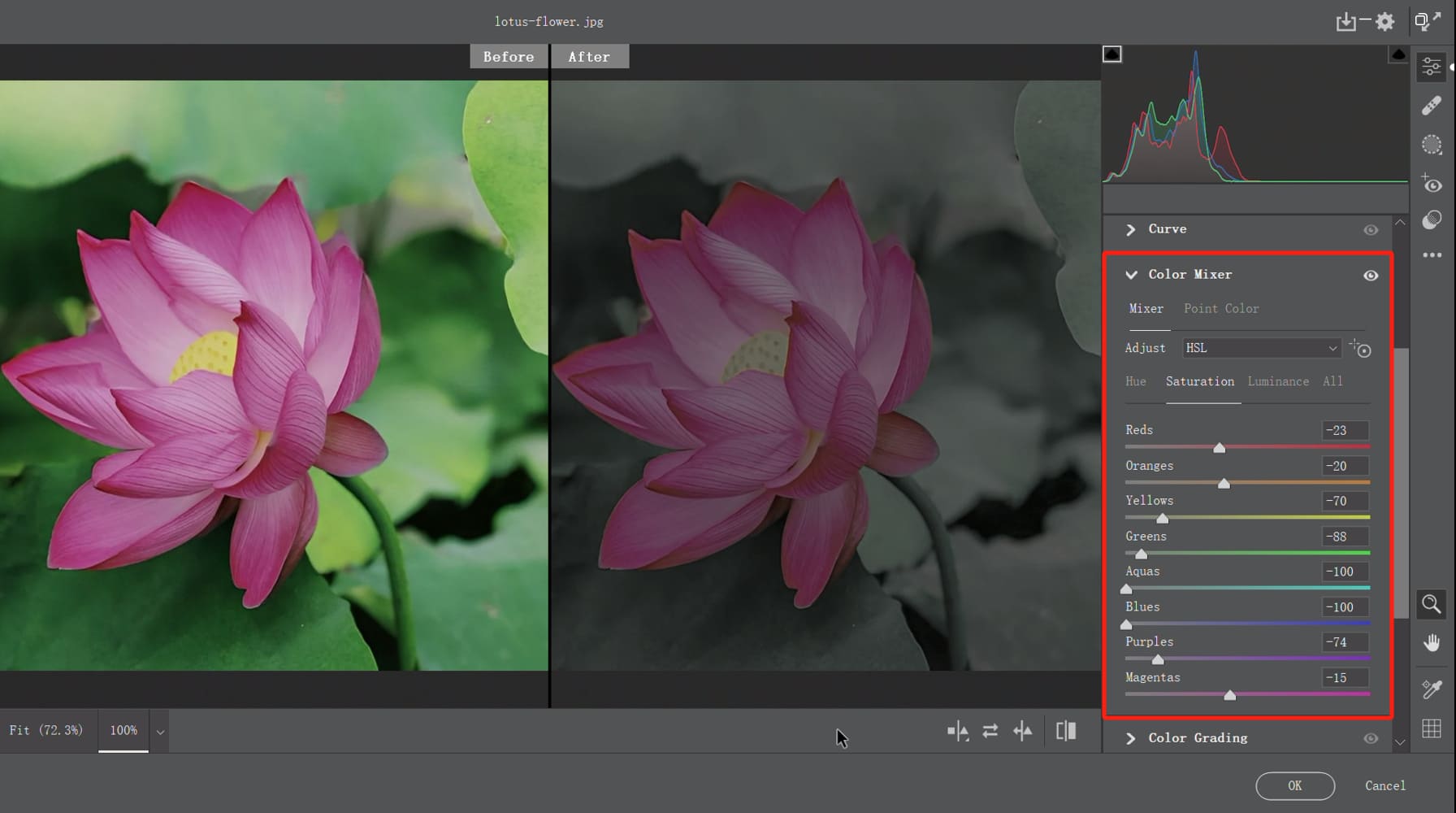
Switch to the Saturation section and decrease the overall color saturation of the image.
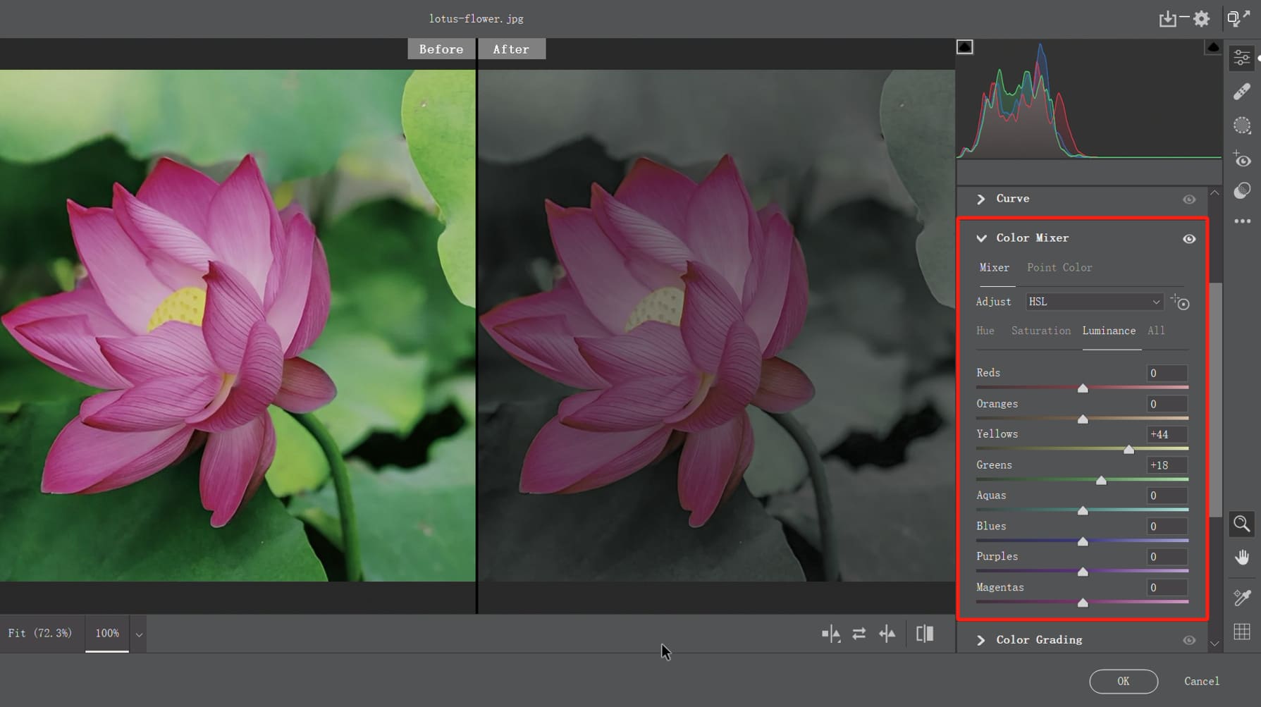
Switch to the Luminance section and increase the brightness of the background lotus leaves (green + yellow colors).
Lastly, we need to address the issue of color harmony in the entire composition. The original photo we are working with has a significant difference in color between the background and the lotus flowers.
To create a unified look, we can continue to harmonize the colors of the lotus flowers and the background, creating a composition dominated by green and warm tones.
Color Grading Thinking:
Give the overall composition a green and warm tone.
You can adjust the Temperature towards warmer tones and shift the Tint towards green.
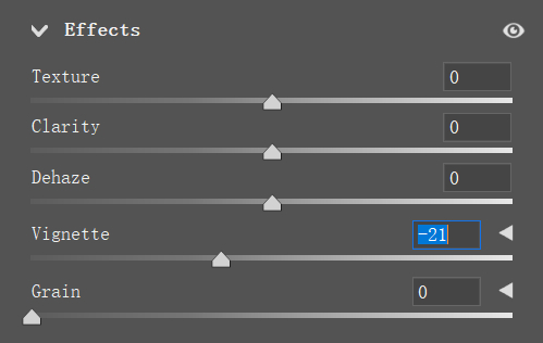
Depending on your preference, you can also add a touch of black vignette in the Effects to enhance the overall effect of the photo.
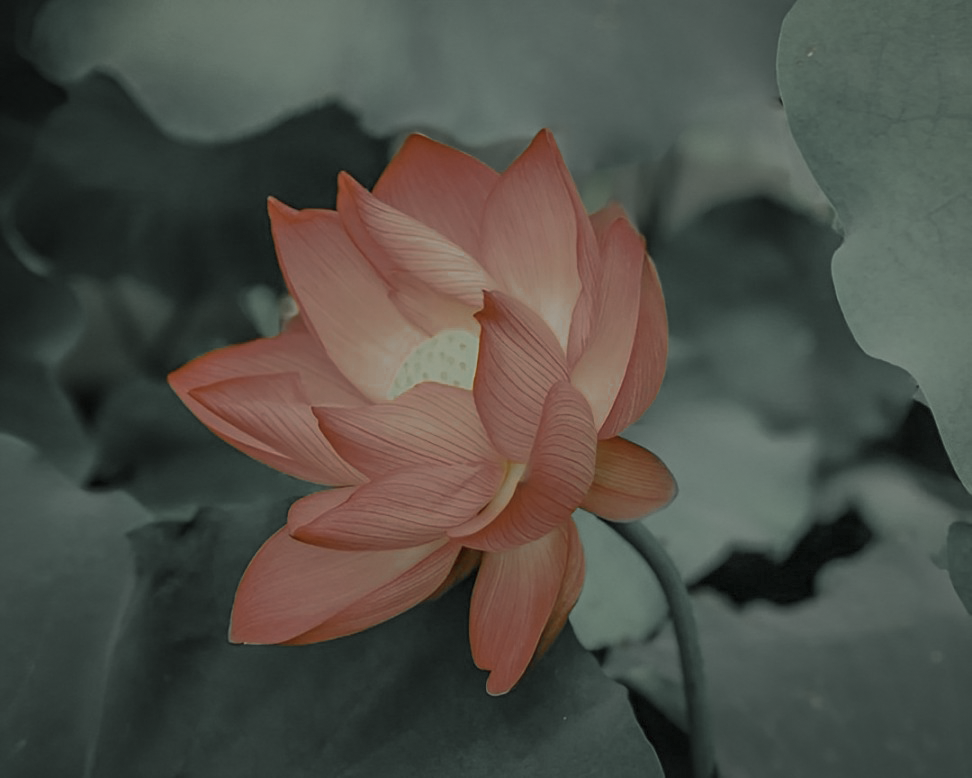
Congratulations, we have successfully achieved the final Morandi color tone for the photo! Let's take a look at the stunning result!
Final Thoughts About Morandi Color
Just like warm sunlight and soothing voices have a healing effect, colors have a three-dimensional impact on our emotions. When we observe Morandi's artwork, we are drawn to the calm, gentle colors and the rational beauty conveyed behind them.
The relaxed elegance is what we love about his work.
So, how can we achieve the desired effect of the Morandi color palette in design and color schemes? We have summarized a few principles:
- Decrease color saturation: Incorporate gray and white tones into commonly used colors to create a harmonious interplay and overall visual balance.
- Utilize intermediate colors: Choose adjacent color combinations or darker intermediate shades within the same color scheme to achieve variety without chaos.
- Avoid an overly dark composition: The essence of the Morandi color palette lies in reducing color intensity rather than eliminating color altogether, maintaining a cool yet vibrant atmosphere.
- Experiment with unconventional elements: Pair minimalist lines with irregular Morandi color blocks to add a lively touch to the composition.
Product Recommendation:
Incorporating Morandi colors into your design and color schemes can be a delightful experience. To enhance your creative workflow and bring more efficiency to your design process, we would like to recommend TourBox.
TourBox is an exceptional tool that seamlessly integrates with your design software, providing you with a more intuitive and ergonomic way to control various functions.

With its customizable buttons and dials, TourBox allows you to navigate through menus, adjust brush sizes, and perform other actions with ease.
Whether you're an illustrator, photographer, or graphic designer, TourBox can greatly enhance your productivity and bring a new level of convenience to your creative endeavors.

Try incorporating the Morandi color palette into your designs with the assistance of TourBox, and witness the magic unfold as your creativity flourishes.